


A new city logo unveiled Tuesday by marketing firm Warp + Weft pays homage to the original city seal, with the honeycomb shape derived from the beehive found on the top of the city seal. Courtesy of Warp + Weft
LEWISTON — The City Council unanimously approved a new logo and branding campaign Tuesday following a two-year effort to update the city’s image.
The new logo, presented to city officials by Auburn marketing firm Warp + Weft, plays on a combination of the city’s original seal and its industrial history.
Officials lauded the design and overall details, stating it will provide a clean slate for Lewiston’s marketing efforts and how the city is viewed throughout the state and beyond.
Councilor Zack Pettengill said he was “over the moon excited about this.”
He said while the design may initially seem like a big change to people, the logo really brings together elements that are already part of Lewiston’s heritage.
According to a news release from Warp + Weft, the honeycomb shape is derived from the beehive found on the top of Lewiston’s original city seal.
“That symbol of industry, activity and community is combined with an inset keystone shape that references Lewiston’s history, architecture, and its central importance in Maine,” it states. “The color palette is a nod to the city skyline, described as ‘brick meets sky’ honoring the city’s industrious heritage.”
The marketing and branding effort, first initiated by the previous City Council, constitutes a new “brand identity” for Lewiston, which will be implemented by city staff and rolled out during a larger branding campaign this spring.
According to staff from Warp + Weft, the brand identity was developed through a community process that included “a cross section of Lewiston residents, business and community leaders, city officials and staff, and valuable outside perspectives.”
The city contracted with the firm in 2019 in hopes of building a more consistent message. At the time, city administration said they hoped the effort would produce a “story” to be used in economic development efforts in attracting new businesses and new residents who might live and work in the city.
A total of $75,000 was budgeted, with about $27,000 set aside for phase two where the city will launch the brand and new marketing and communication materials.
Warp + Weft held 21 focus groups; one-on-one interviews; and conducted thousands of online and printed surveys that generated roughly 14,000 answers. The company used the feedback to produce the branding strategy, which could be used on everything from the city’s website and social media accounts, to downtown banners and vehicle decals. An image shared with the council Tuesday showed the new logo on a Public Works truck.
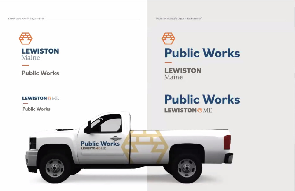
A rendering shows what Lewiston’s new logo could look like on a Public Works vehicle. Courtesy of Warp + Weft
“The in-depth discussions and research allowed us to objectively define what makes Lewiston stand out from peer cities and the benefits it provides for the people who call the city home as well as potential newcomers,” said Jennie Malloy, director of strategy and a founder of Warp + Weft.
Malloy said what sets Lewiston apart can be summed up in one phrase: “affordable, accessible and abundant opportunity.”
Mayor Mark Cayer said he’s excited by the new logo and brand, and is looking forward to seeing how it is used in city marketing efforts.
“The new brand identity provides a refreshing new look at Lewiston for prospective entrepreneurs, visitors, and residents alike,” he said. “The new brand will enable all of us to rally even more effectively around our proud heritage and to tell our continuing story of success, growth and vision for the future.”
Molly McGill, senior writer at Warp + Weft, said the materials will be integrated into to city’s website and signs, and the public campaign will include video advertising and a social media push.
Other councilors said the effort was overdue, including Councilor Stephanie Gelinas who said the campaign is a return to “relevance.”
Councilor Lee Clement said he’s long believed the city needs to change its image.
“This is going to be an exciting way to start doing it,” he said, adding it can “do away with the dirty image of Lewiston’s past.”
Councilor Safiya Khalid, the youngest on the council, said her generation is visually-oriented, and is hoping that more photography and other visuals can be incorporated into the campaign.
Several members of the public also commented Tuesday, including Linda Scott, who said it will be important to get the larger community to embrace the campaign.
Pettengill said the re-brand couldn’t come at a better time.
“There’s a lot of rebirth going on out there,” he said. “I think it can capture the essence of Lewiston, the energy we have that’s underneath the surface.”
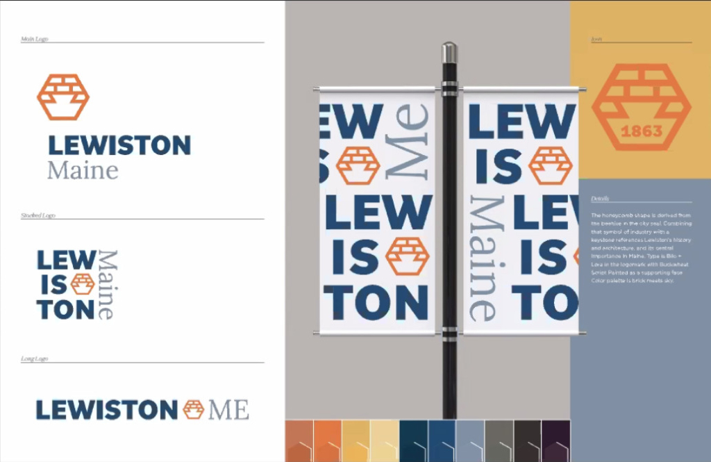
A concept image shows what Lewiston’s new logo would look like in a variety of formats, including street banners. Images courtesy of Warp + Weft
Send questions/comments to the editors.

Success. Please wait for the page to reload. If the page does not reload within 5 seconds, please refresh the page.
Enter your email and password to access comments.
Hi, to comment on stories you must . This profile is in addition to your subscription and website login.
Already have a commenting profile? .
Invalid username/password.
Please check your email to confirm and complete your registration.
Only subscribers are eligible to post comments. Please subscribe or login first for digital access. Here’s why.
Use the form below to reset your password. When you've submitted your account email, we will send an email with a reset code.