


A new logo and brand rollout in Lewiston led to some passionate responses online, but city officials say the marketing campaign is much larger than a logo, and is long overdue. City of Lewiston
LEWISTON — A new logo and brand rollout in Lewiston last week led to some passionate responses online, but city officials say the marketing campaign is much larger than a single logo, and is long overdue.
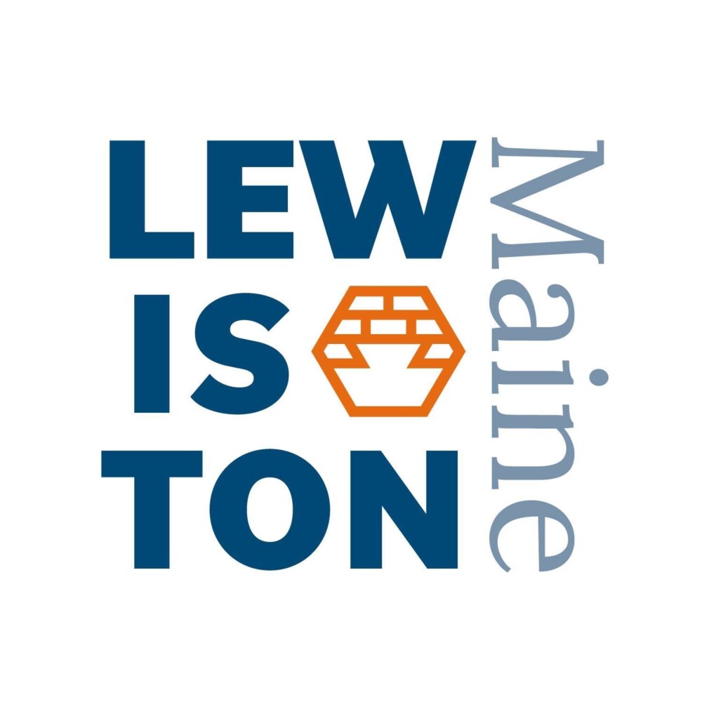
Despite an initial mixed reaction from the public — mostly centered on the new honeycomb-shaped logo — city officials said this week that they are confident that the overall branding campaign will yield positive results.
When the city first posted the logo and color scheme to its social media pages last week, it was accompanied by a statement that attempted to explain the changes and the reasons behind them.
“Change is often difficult at first, but necessary for successful evolution,” it said. “You’ll have questions and comments. They won’t all be great. We know that.”
The page’s administrator was then tasked with replying to a flood of comments ranging from the visceral and unfiltered opinions typical of social media, to those supportive of the effort.
Some didn’t understand the logo, others took issue with the budget.
One of the top comments on the post is from School Committee member Kiernan Majerus-Collins, who said, “Lewiston deserves a great brand, one that doesn’t require an explanation to be understood. I really hope the city will take the tepid (at best) response to this branding effort to heart, and go back to the drawing board.”
A day earlier, the City Council had approved the branding campaign after more than a yearlong process with Auburn marketing firm Warp + Weft to engage resident feedback. Staff from the company explained that the honeycomb shape was inspired by the beehive found on the top of the original city seal.
“Symbolic of industry, activity and community this modern take on the beehive was combined with an inset keystone shape referencing Lewiston’s history, architecture, and its central importance in Maine,” a statement said.
Responding to the initial reaction, officials from the city and Warp + Weft said they’ve heard positive feedback outside of social media, and that “a brand is much more than a logo.” The broader branding effort is meant to rally the community into getting behind a consistent message.
“Overall, we expected to receive some mixed reactions with the rollout of a new brand and most importantly we are listening to the feedback we’ve received,” City Administrator Denis D’Auteuil said. “We are working with Warp + Weft to further develop our brand strategies based on the feedback we have received and we look forward to working with Warp + Weft and the community to build a strong brand for Lewiston as we move forward.”
D’Auteuil said the city appropriated $100,000 for the process, brand creation, and initial rollout of messaging, with a current balance of $22,460 remaining for the project. Officials have said a larger marketing effort will be rolled out in the spring or summer.
Mayor Mark Cayer said while the logo “took a bit of a hit on social media,” he’s heard positive things from a number of people who might not engage in social media. He also reiterated that the logo is just a small facet of the broader branding effort.
“I think when you look at the whole package, this is going to do really great things for our community,” he said.
As president of the Downtown Lewiston Association and as a business owner, Michael Dostie said he’s glad that the city has finally put some focus on marketing. He’s encouraged by the effort, even if, as a lifelong Lewiston resident, he admittedly doesn’t feel a connection to the new logo.
“It’s far, far overdue,” he said Wednesday. “It’s one of the best things I’ve seen this city do in a long time.”
He said he’s seen several comments on the cost of the initiative, but said it’s not unexpected.
“When you overlook a certain investment for a long period of time, it’s going to be a heavy investment to correct the oversight,” he said.
As a whole, Dostie said he thinks the campaign is “fantastic.” He likes the color scheme, fonts and messaging. As for the symbol itself, “There’s a disconnect there,” he said. “I don’t see it as a municipal emblem. But, it’s one component in a much larger picture.”
Before creating the brand, Warp + Weft held 21 focus groups; a series of one-on-one interviews; and conducted thousands of online and printed surveys that generated roughly 14,000 answers.
Aimee Goodwin, owner and creative director of Warp + Weft, said this week that municipal branding “is no small feat,” and that due to the number of stakeholders, “feedback was anticipated.”
“We are encouraged by the positive comments and applaud the city for engaging in dialogue with those who have shared their thoughts candidly,” she said.
And while she said, “opinions matter and are welcome,” she said “negative voices are often the loudest, especially on social media.”
Goodwin said defining a brand includes a “full verbal identity” on top of a new visual identity, and said she’s hoping that as the work continues, “more of the brand will be revealed in a context that will be easier to understand, and, we hope, additional people will join in supporting.”
“Change can be difficult at first,” she said. “A brand can’t change or make policy, but it can clearly define principles and present unity that can help to strengthen and grow a city. This is what Lewiston is committed to and what the brand represents.”
Send questions/comments to the editors.

Success. Please wait for the page to reload. If the page does not reload within 5 seconds, please refresh the page.
Enter your email and password to access comments.
Hi, to comment on stories you must . This profile is in addition to your subscription and website login.
Already have a commenting profile? .
Invalid username/password.
Please check your email to confirm and complete your registration.
Only subscribers are eligible to post comments. Please subscribe or login first for digital access. Here’s why.
Use the form below to reset your password. When you've submitted your account email, we will send an email with a reset code.