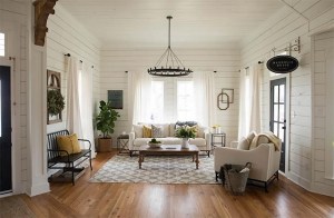
Good news, renters. White is in. When two major paint companies, Benjamin Moore and Sherwin-Williams, chose shades of white for their pick of 2016 (Simply White and Alabaster, respectively), your plain, unpaintable walls became your greatest asset.
“White makes the space look bigger,” says Pamela Gaylin Ryder, an interior designer based in Washington. “There’s more continuity with open floor plans. It doesn’t break the space up. And it makes it look a lot cleaner and spacious.”
The challenge is making that white-based color palette feel intentional and lived in, not borrowed. You want it to have texture, interest, dimension, impact. For expert ideas on making white walls feel serene and homey, we talked to Ryder, EasyPaint’s Tracy Morris and Joanna Gaines, co-host of HGTV’s “Fixer Upper” (with her husband, Chip), who almost always sticks to a simple palette. Instead of limiting you, think of those neutral walls as opening the door to all kinds of design possibilities.
• Add vintage-style and heirloom pieces
Your favorite art and family pieces actually get lost with bold-colored walls; white walls allow them to be seen. “White is a great palette for anything that’s interesting from a design standpoint,” Gaines says. “Incorporate architectural elements, old carvings, old windows, old mantels, old clocks. They really help to balance the stark white.” Gaines advocates taking your time to find the right older pieces, but if you want to create the “found” look fast, search for items in stores that already have a vintage feel to them, whether they reuse materials in a new way or are reproductions of older items.
• Make white walls look intentional
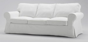
No one has to know you’re stuck with white. When you tie other neutrals into your color palette, whether it’s with a white sofa like the one Gaines has in her Texas home or with a clear coffee table, your white walls are going to look purposeful and sharp. “The main big pieces – the sofa, coffee table, chairs and the walls – those should be lighter or more neutral so that your eye can focus on the bolder pieces,” Morris says. (Homeowner tip: If you’re able to paint your walls and want white, Morris recommends Benjamin Moore’s White Dove – especially if you like a contemporary look and want to paint the walls and trim the same color. She also likes Benjamin Moore’s Ballet White for those with art collections and Maritime White for houses by the beach.)
• Lay the foundation with a rug that has some white
“I always start with the rug,” Morris says about designing a room. “Paint can be customized, art can be commissioned, but there are often only a small amount of rugs that work for a space.” If the main pieces in a room are white – sofa, coffee table, chairs – Morris says it’s okay to go bold with the rug. Make sure the rug pattern has some white in it, though, Gaines says, “so that it ties into the white walls.”
• Introduce other colors strategically
White goes with everything, which means that it’s the perfect backdrop for changing out colorful accessories seasonally. Gaines likes to pick up fun things at good prices from Target and West Elm; for February, she has a touch of a red-and-white theme in her living room. Ryder likes to do the same. “I’m an advocate of keeping a great backdrop and letting artwork bring heart and soul into the house,” she says.
• Give the room a focal point
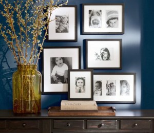
Having one standout element in the room – such as big, bold art or a masterful grouping of smaller art – makes it feel calm; your eye isn’t wandering from thing to thing. “If you can’t paint the walls, really get creative above the sofa,” Gaines says. Put up “a collage of frames with color in them . . . photographs that you take over the weekend of nature. The white walls allow the frames and artwork to really be the focus.”
Keep the frames all one color for a strong statement. “Black frames stand out on white walls,” Ryder says. “Even white-on-white, shiny white frames, with black-and-white photos look good.” Or mix different styles, but no more than two. For example, “you could do black and gold, or you could do black and silver,” Morris says. Keep the arrangement to an odd number of items, she adds, and throw in a mirror to make it even more eye-catching.
• Use organic elements
The fastest way to inject life into a stark space is to add living things. Consider air plants; at most, you’ll need to submerge them in water for two to three hours every few weeks. And pick up flowers when you can and arrange them in an interesting vase. In between fresh bouquets, Gaines likes high-quality faux florals. “Good fake florals and good pillows can stand the test of time,” she says.
• Think about texture
Texture takes a design from stark and cold to interesting and warm. It helps you “warm up the space while still having a real simple palette,” Gaines says. The designer and owner of retail store Magnolia Market also likes to hang baskets with faux florals or leaf wreaths on the walls to give them texture. Anything the hand wants to reach out and touch is a winner here.
Roberts is a freelance writer. She can be found at lindseymroberts.com.
What’s in and out in home design
While your furniture, finishes and accessories should be a reflection of your personal taste, there’s no question that fads come and go in home decorating. After all, you rarely see avocado green appliances these days unless someone is going for a retro look.
Zillow recently surveyed interior design experts and reviewed which photos were trending on the Zillow Digs site to determine what’s in — and what’s out — in interior design this year.
Among the design elements you should expect to see in more model homes and newly decorated are homes are:
• Art Deco-inspired patterns and shapes: You’re likely to see these in artwork, wallpaper, mirrors and lighting fixtures.
• Nubby wool rugs: Natural fibers are popular for their look and feel.
• Encaustic tiles: These elaborately colored tiles, made of glazed clay, can be used in bathrooms, kitchen backsplashes and even on floors in rooms where you want a little drama.
Zillow’s design experts say the trends you’re likely to see fade this year, in part because they’ve been used too many times, include:
• Mason jars: They’re inescapable in hipster restaurants and bars and as light fixtures in kitchens, so the trend has probably run its course.
• Chalkboard paint: While the paint makes a great message board in the kitchen or a place for artistic expression in a kids’ bedroom or playroom, the reality is that the chalkboards can just look messy after awhile.


Comments are no longer available on this story